Is Tesla in Turbulence?
Tesla, the pioneering electric vehicle (EV) manufacturer, has long been a leader in the industry, boasting innovation, cutting-edge technology, and a dedicated consumer base. However, recent challenges, including production issues, regulatory hurdles, and mounting competition, have raised concerns for investors. Understanding these factors is crucial in evaluating Tesla’s stock trajectory and making informed investment decisions.
Production Challenges
Tesla has faced notable production bottlenecks, particularly in scaling up manufacturing capacity to meet global demand. The company has encountered supply chain disruptions, semiconductor shortages, and logistical delays, which have hampered output. Additionally, production ramp-ups at new Gigafactories in Texas and Germany have taken longer than anticipated, leading to delivery shortfalls. These constraints have slowed revenue growth and raised questions about Tesla’s ability to sustain its dominance in the EV space.
Regulatory Hurdles
Governments worldwide have intensified regulatory scrutiny on EV manufacturers, and Tesla has not been spared. Safety concerns, recalls, and investigations into Autopilot and Full Self-Driving (FSD) technology have put the company under regulatory pressure. The National Highway Traffic Safety Administration (NHTSA) has launched multiple probes into Tesla’s driver-assistance features, raising concerns about safety compliance. Additionally, emissions and battery recycling regulations in Europe and China could force Tesla to modify its operational strategies, potentially affecting profit margins.
Mounting Market Competition
While Tesla was once the uncontested leader in the EV market, competition has surged dramatically. Legacy automakers like Ford, General Motors, and Volkswagen have intensified their EV production, offering competitive alternatives to Tesla’s lineup. Meanwhile, emerging players like Rivian and Lucid Motors are pushing innovation, attracting consumers and investors alike. Chinese automakers, including BYD and Nio, have also gained ground, leveraging government support and lower production costs. This rising competition puts pressure on Tesla’s market share, pricing power, and long-term growth projections.
Impact on Tesla’s Stock and Investor Sentiment
These challenges have led to increased volatility in Tesla’s stock. While the company continues to post strong revenue figures, concerns over slowing deliveries, regulatory risks, and competition have resulted in a more cautious investor approach. Analysts remain divided on Tesla’s valuation, with some citing strong brand loyalty and innovation as reasons for long-term optimism, while others warn of overvaluation and growing industry risks.
Final Thoughts
Despite the headwinds, Tesla remains a formidable force in the EV sector. The company’s aggressive push in AI-driven autonomous driving, energy solutions, and international expansion could help mitigate short-term setbacks. However, investors should closely monitor production efficiency, regulatory developments, and competition trends when evaluating Tesla as an investment. As the EV landscape evolves, Tesla’s ability to adapt and innovate will be the key determinant of its future success.
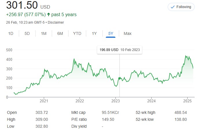
TESLA TSLA – Last 5 years, tesla has performed well and raked up more than 570 percent returns.
Guys from India can participate in TESLA growth story by investing In tesla using a platform called Vested. It is simple to use and straight-forward. It lets you purchase fractional shares too. Please follow this link to do so.